Colour
Navy and sun. The default, on sand or white.
Brand kit
The logo in every colourway and format a print shop, an embroiderer or a journalist asks for, with the colours and the type behind it. Take the lot, or just the piece you need.
Download the whole kitZIP · 13 MB · logos, colours, fonts, print filesA browser window with the coast inside: the chevron of code, the wave and the sun. Vector first (SVG or PDF; EPS for older shops), PNG when a vector is refused.
Navy and sun. The default, on sand or white.

One colour, for one ink or one thread.

Reversed, on navy. How the footer shows it.

Reversed, on navy, black or a dark photo.

One colour on dark garments and surfaces.

Stamps, engraving, anything without colour.
The mark with the wordmark. The horizontal one is the default; the stacked one suits square spaces like a hat front or a sticker. The wordmark is already outlined, so no font is needed.
Navy and sun. The default, on sand or white.

One colour, for one ink or one thread.

Reversed, on navy. How the footer shows it.

Reversed, on navy, black or a dark photo.

One colour on dark garments and surfaces.

Stamps, engraving, anything without colour.
Navy and sun. The default, on sand or white.
One colour, for one ink or one thread.

Reversed, on navy. How the footer shows it.

Reversed, on navy, black or a dark photo.

One colour on dark garments and surfaces.
Stamps, engraving, anything without colour.
Navy and sun. The default, on sand or white.

One colour, for one ink or one thread.

Reversed, on navy. How the footer shows it.

Reversed, on navy, black or a dark photo.

One colour on dark garments and surfaces.
Stamps, engraving, anything without colour.
Navy and sun. The default, on sand or white.
One colour, for one ink or one thread.

Reversed, on navy. How the footer shows it.

Reversed, on navy, black or a dark photo.

One colour on dark garments and surfaces.
Stamps, engraving, anything without colour.
Round versions for profile pictures, stickers and patches, and the app icon.

Profile picture, sticker, patch.
The same on a pale sticker.
The coast through a ring. Instagram.

For white stock.

Rounded square, navy.

For stores that round the corners themselves.
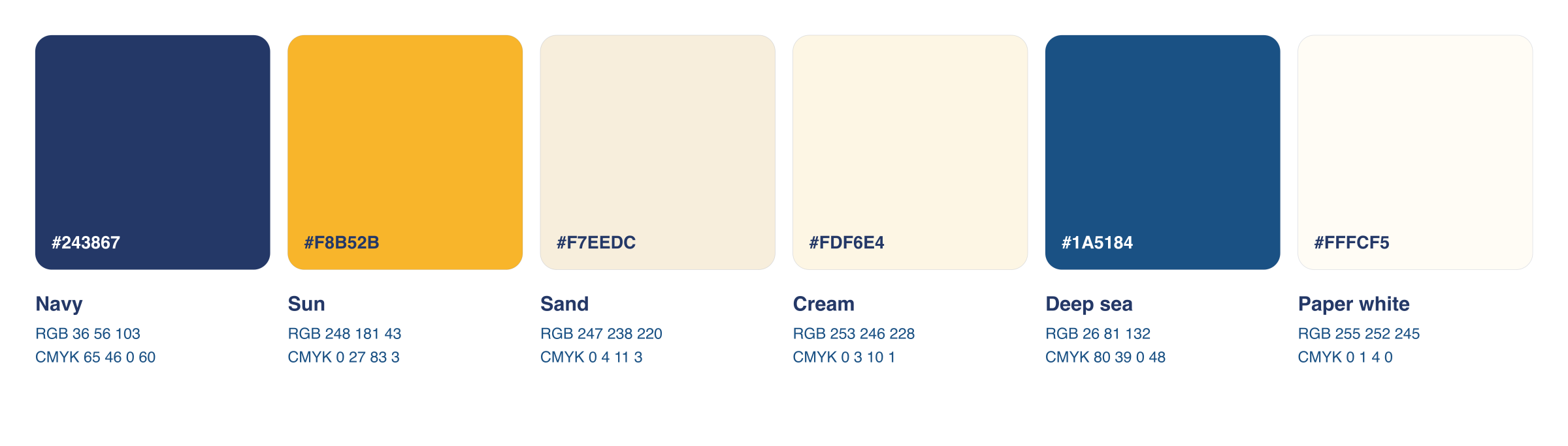
Three colours do the work: navy, sun and sand. The HEX values are the source of truth; the CMYK column is a plain conversion for shops that ask, so have them match the swatch rather than the numbers.
#243867
The ink. Mark, wordmark, headlines.
#F8B52B
The accent. The sun, the dot, the rules.
#F7EEDC
The paper. Backgrounds, cards, the poster.
#FDF6E4
Lighter sand, for badge faces.
#1A5184
Secondary text and taglines.
#FFFCF5
Warm white panels on sand.
Fraunces for the wordmark, headlines and names. DM Sans for everything else. Both are free, open source and on Google Fonts; the variable files are here for anyone setting new text.
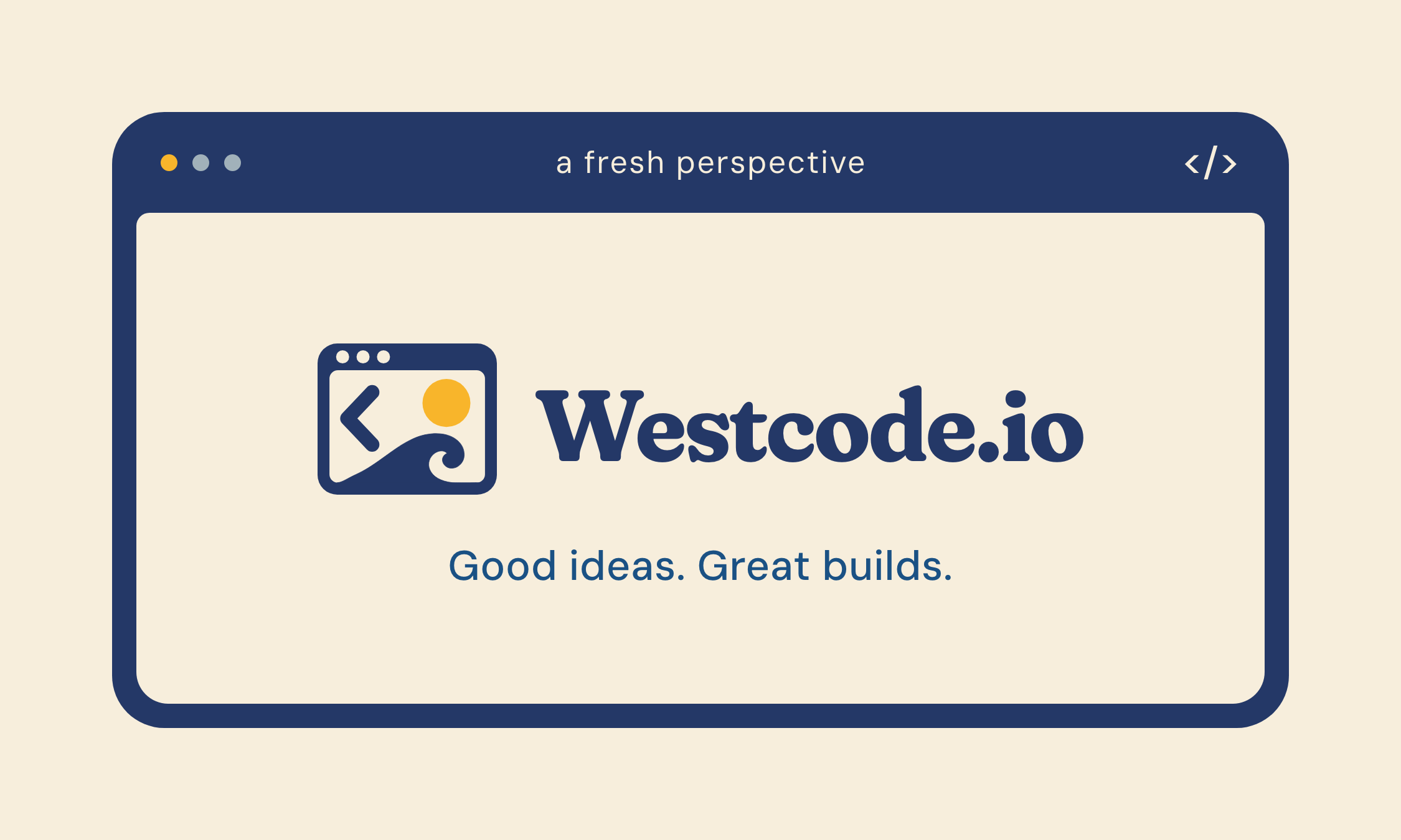
Good ideas.
Great builds.
Fraunces · 700 · optical size 144 · tracking −0.02 to −0.05 em
An independent digital studio, out west. Kelowna and Vancouver, clients across Canada and the US.
DM Sans · 400 text, 500 labels · uppercase labels tracked +0.14 em
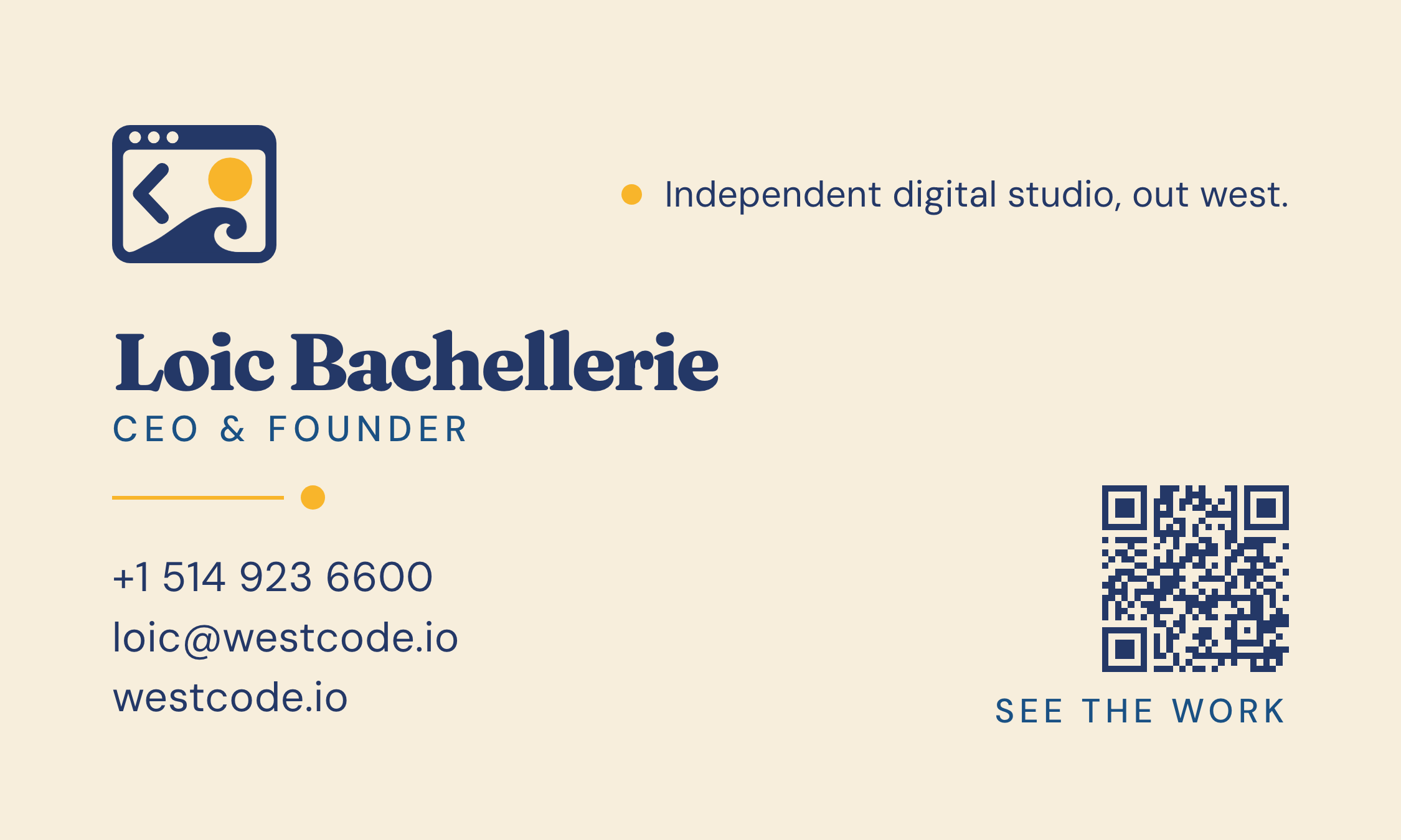
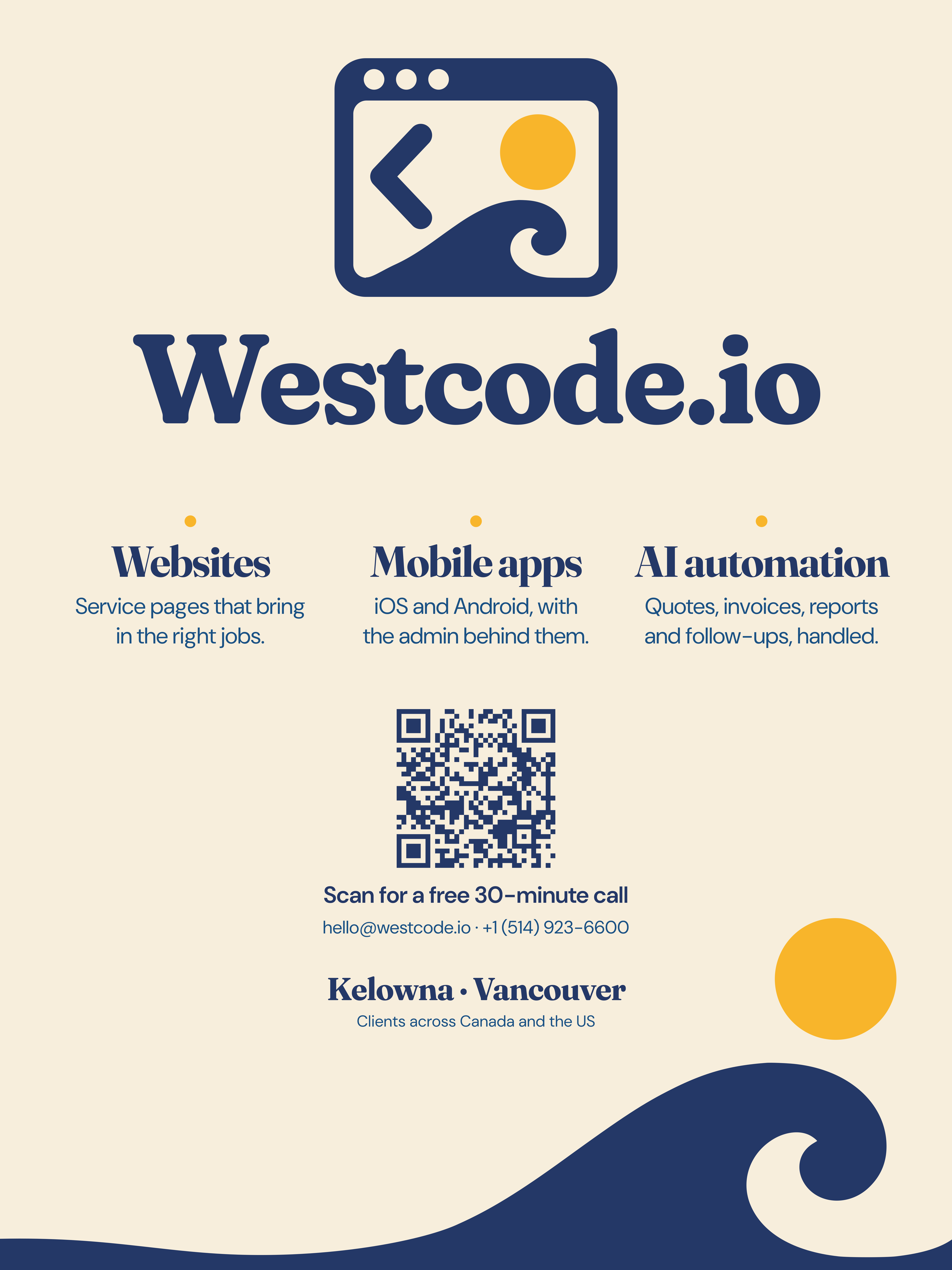
Files at their final size with bleed, for the shop to use as they are. Cards are 3.5 x 2 in trimmed (3.75 x 2.25 in with bleed); the poster is 18 x 24 in.
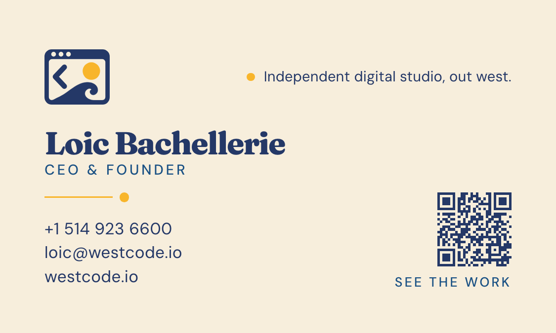
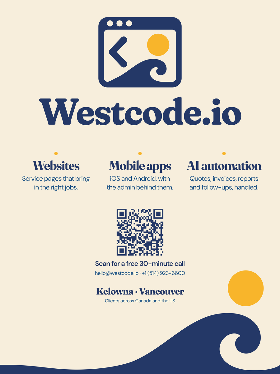
Profile pictures and the link preview image are in 05-social inside the kit.
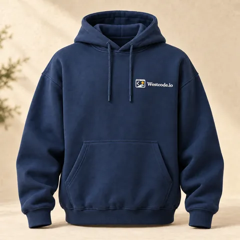
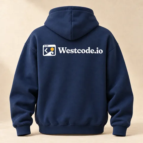
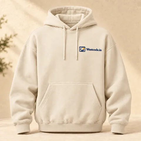
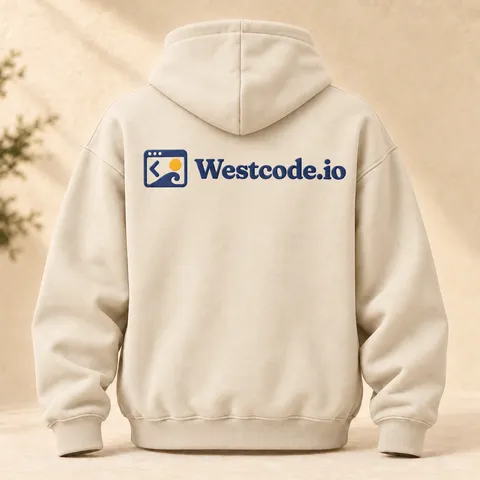
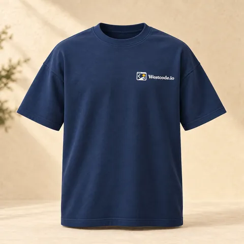
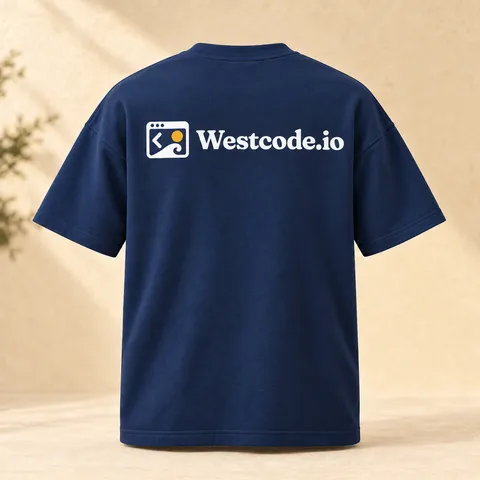
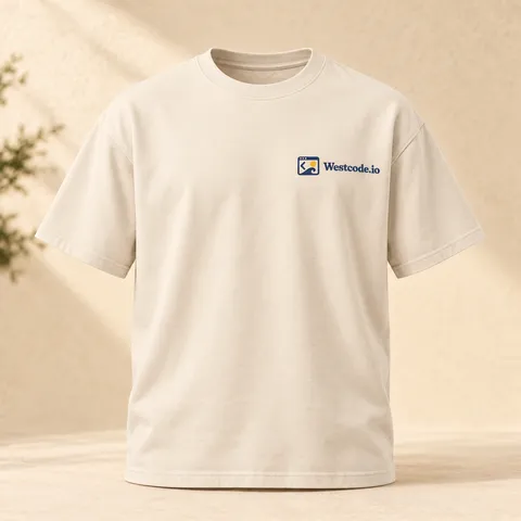
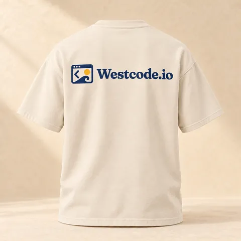
How the lockups look on caps, hoodies and tees: always with Westcode.io, so people can find us. Want one? Ask for a piece.
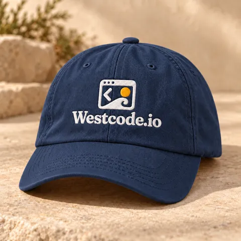
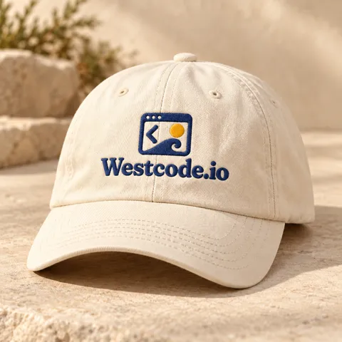
Need a size or a format that isn't here? Write to hello@westcode.io.